Overview
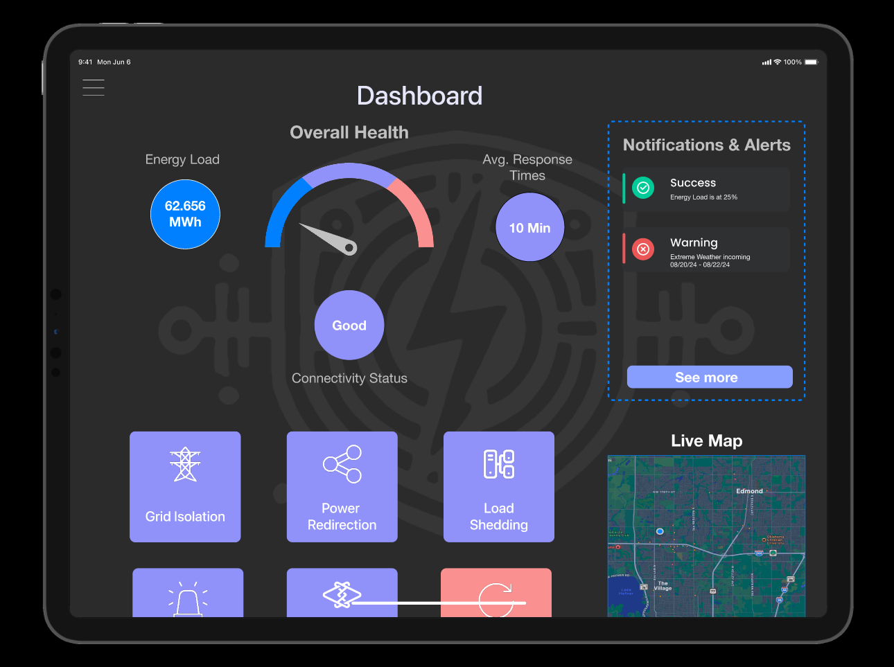
GridGuardian was designed for renewable energy technicians who need a clear, real-time view of power distribution, load balancing, and alert systems. The dashboard provides a unified interface to monitor performance, troubleshoot, and analyze trends without cognitive overload.
Challenge
Energy management systems produce enormous amounts of telemetry data. The core challenge was to visualize this information hierarchically so that users could instantly identify system health while still accessing deeper metrics when necessary.
Process
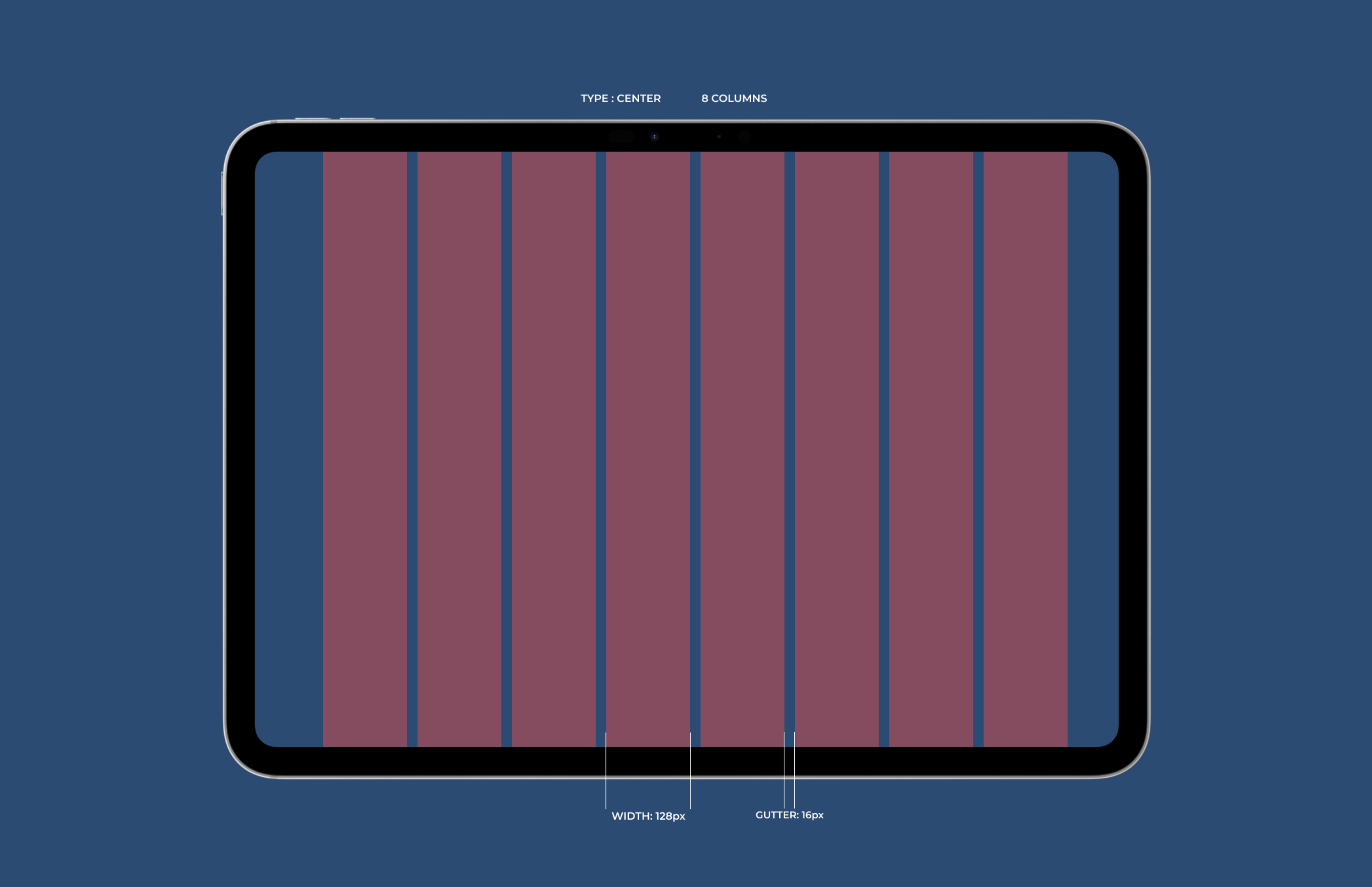
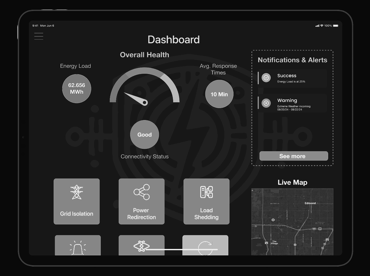
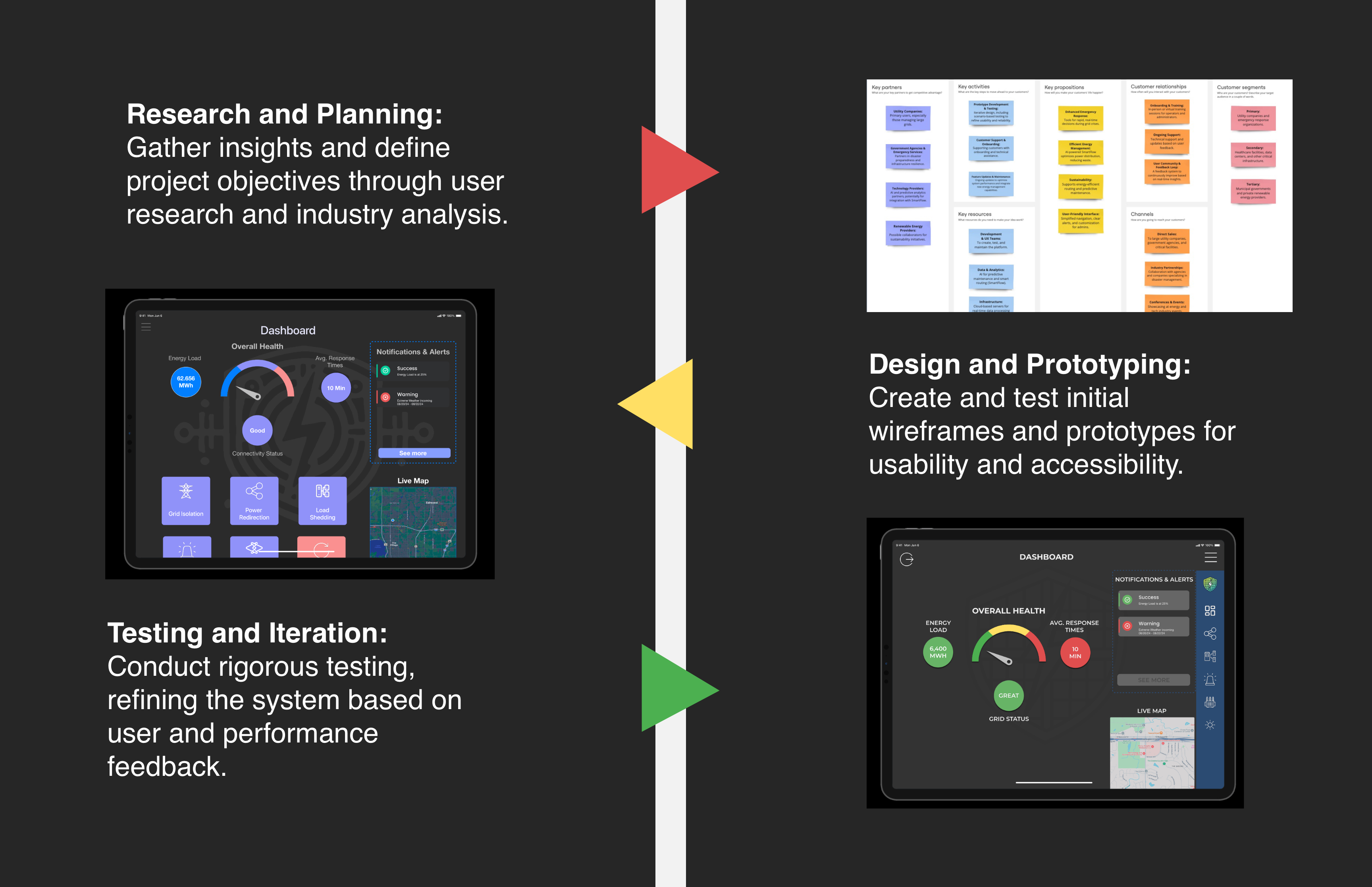
The design process began with contextual inquiry and data mapping. I worked to identify what data points mattered most during critical tasks and what could be deprioritized. Early wireframes established a modular card system that later evolved into responsive layouts optimized for different screen resolutions.
Visual Language
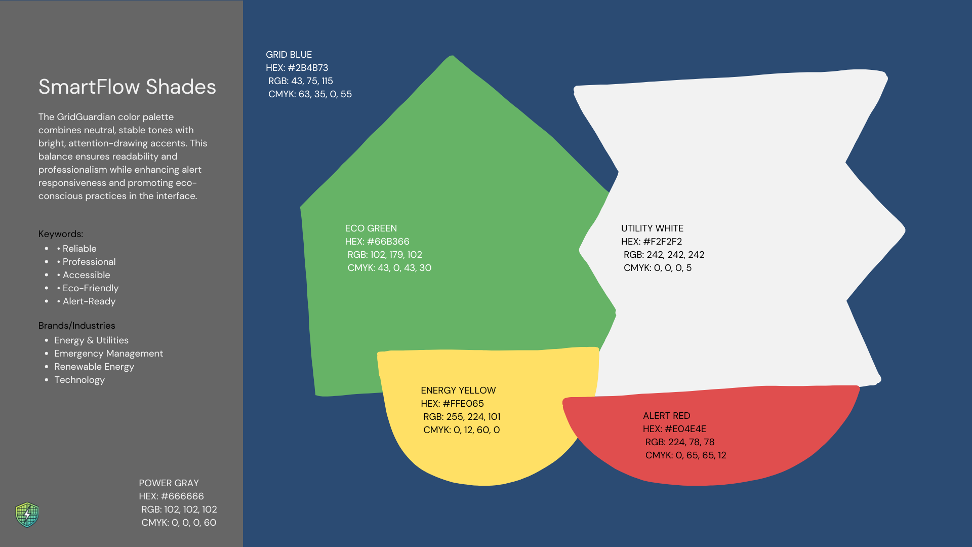
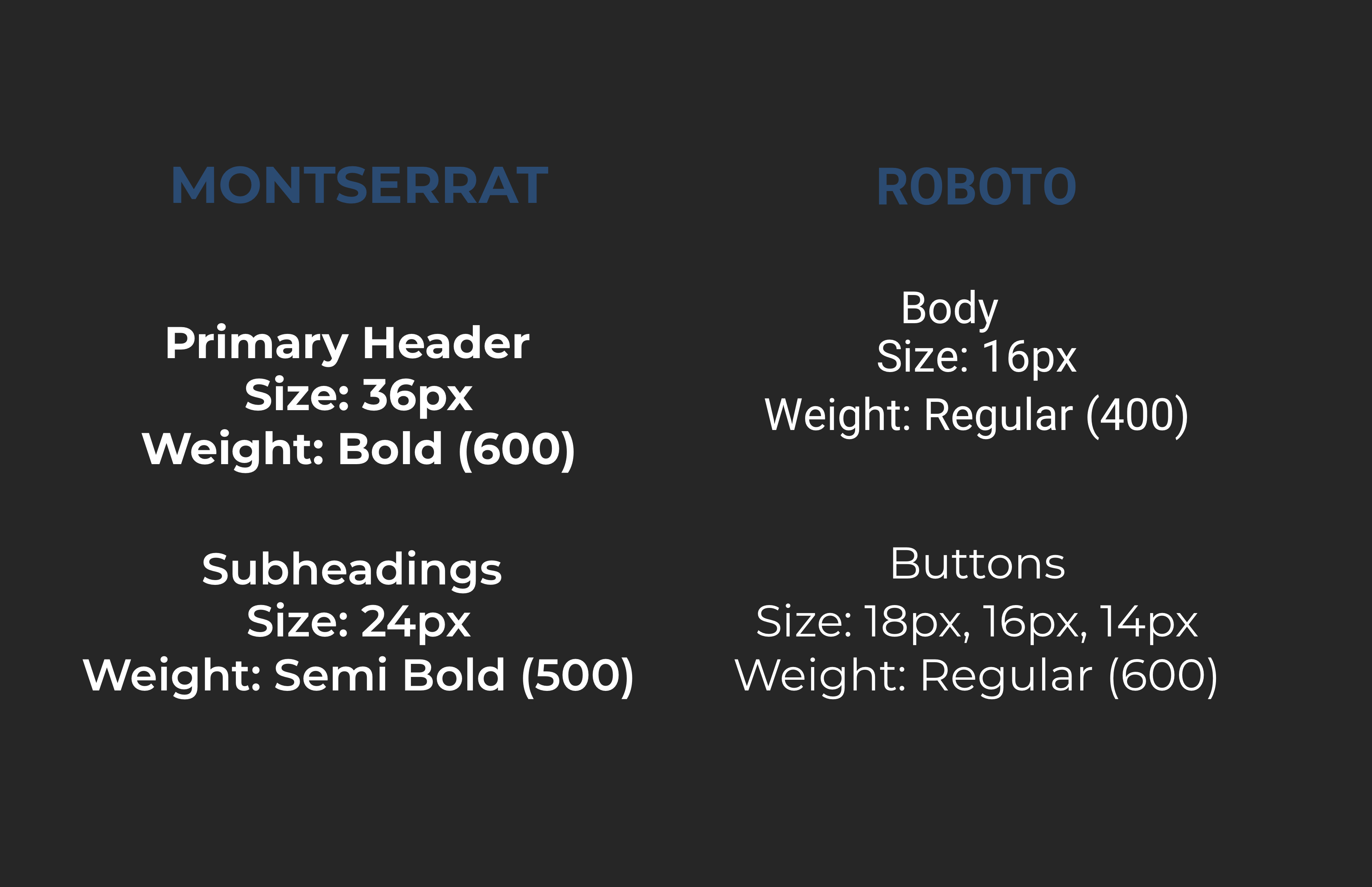
The visual identity was inspired by electrical flow — with strong contrast, cyan accents for energy activity, and a muted dark slate base for readability in control room environments. The typography and color palette were tested for accessibility compliance.
Behance Interactive Case Study
For a deeper dive, you can explore the full interactive case study below. It’s embedded directly from Behance, preserving scroll, transitions, and interactions:
Outcome
Usability testing showed technicians could detect system anomalies 40% faster with GridGuardian than their previous interface. The final design achieved high marks for visual clarity and reduced task load during critical monitoring events.